Design • 27 May, 2020 • 6 min read
Interior Color Coordination Tricks that Everyone Needs to know
Here we share some tips and tricks for basic interior color coordination, so that you can design your space like an absolute pro. Bring some harmony to your home!
By Edvin BrobeckStarting Out With Interior Color Coordination
Interior color coordination is often overlooked, but is key to help bring some harmony to your home! Here we share some tips and tricks for basic interior color coordination, so that you can design your space like an absolute pro.
IDEA ONE
Warm Neutral
Trend alert! Neutral colors are all the rage for 2020, and are a great way to get a luxurious feel at home without having to put too much effort with your color combo.
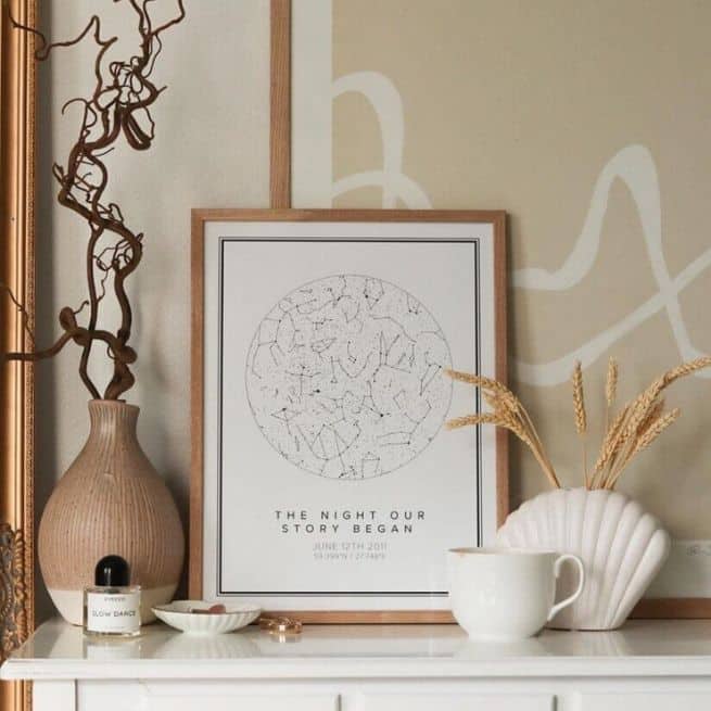
Just stick to classic neutral colors like black, white, gray and beige. They can be both warm and cold, and can be accented with creamy white hues and earthy tones.
Can’t decide which? A quick trick used by pro interior stylists is to pull the colors from a fabric that you like that already fits your interior, whether it be cushion covers or your duvet set. This way, the fabric designer has already done the matching for you!
IDEA TWO
Triadic
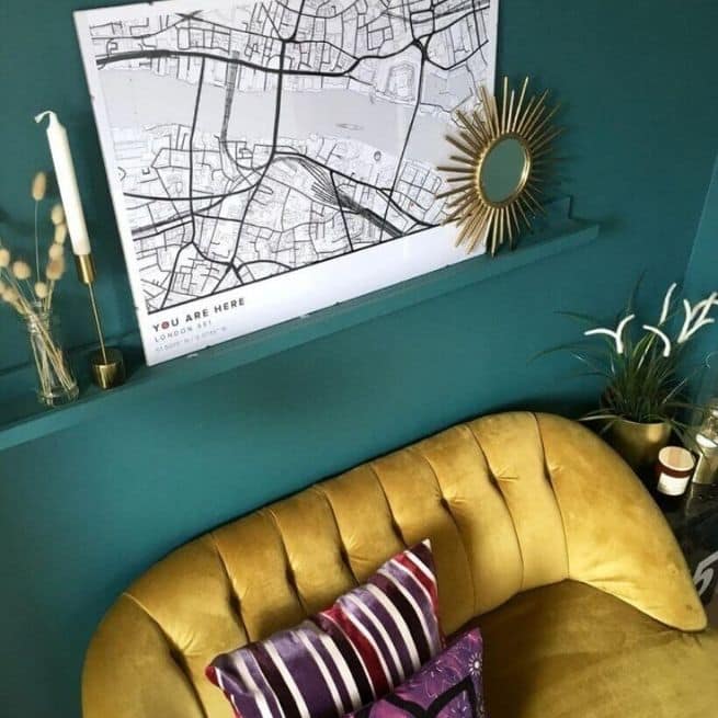
Love bright colors? Triadic interiors are often bright and uplifting, and, as you might have guessed, rely on a scheme made up of three bright colors. Getting the right interior color coordination here is key!
To choose the three colors for your space, the simplest way is to pick three colors that are evenly spaced on the color wheel. To incorporate them into your set up, pro interior stylists often use the 60-30-10 rule.
The idea behind this is to help you achieve some balance when decorating with color, with 60% of the room being made up of the main color, 30% from the secondary color, and the last 10% as an accent.
Red, yellow and blue are perhaps the obvious choice here, but you can also pick from anywhere in between!
IDEA THREE
Mono
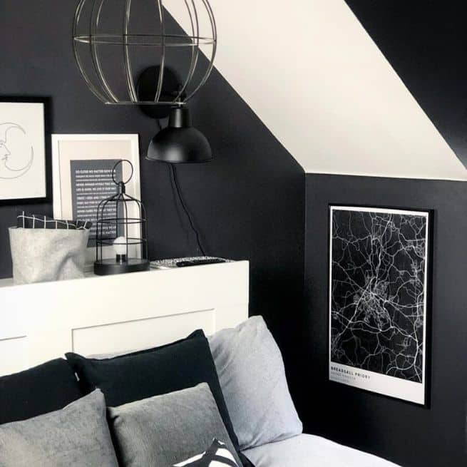
A monochrome color scheme means that every shade you use comes from the same base color. It doesn’t just mean decking out your space in black and white!
There are an incredible variety of shades, tones and shifts in a single color, making it easy to create a finely balanced and calming interior. A great tip for this kind of interior theme is to use a variety of materials and shapes to add some intriguing textures. Make it extra eye-catching!
Scandinavian interiors ace the monochrome color scheme! Click here to out our introduction to Scandinavian styling.
Free E-Book:
How To Make Your Home More You
Tired of looking at the same old interior? Sign up and receive this limited edition Mapiful e-book, and discover community tips just like this one that teach you the art of personalizing your space, your way!
Additional reading

13 January, 2022 • 10 min read
Valentines Day Ideas For Couples: Personalized Prints
Looking for a meaningful gift for your partner? Turn your love story into wall decor and try these six ideas for creating custom poster gifts for Valentine’s Day.
5 January, 2022 • 7 min read
Gift Guide Issue 1: Creating The Perfect Personalized Gift
Wondering how you can create personalized gifts for loved ones, near and far? Read on for three feel-good ideas for creating and gifting meaningful custom prints, for everyone on your list.

4 January, 2022 • 10 min read
How to Create A Deeper Connection With Your Partner
Create a deeper and healthier connection with your partner and ask these six questions when communication falls flat. Warning: question six alone causes instant sparks to fly!


